Oddly enough, we have had three clients this week ask us about “above the fold” when it comes to web design.
Their concern is that visitors to their websites (designed by various design firms — including ours) are missing important information because those visitors have to scroll to see it.
While “above the fold” is a valid (and popular) concern when it comes to web design (the stats are shocking), it’s one that is often misunderstood and can lead to outdated websites that are difficult to use.
So, let us clear this up for you, once and for all — as the success of your winery’s website may depend on it.
First, what is “Above the Fold”?

“Above the fold” is a term that originated with newspapers. It’s the top-half of the front page that is “above the fold” of the paper. It’s the portion of the paper that editors believe sell a newspaper (or sold a newspaper, as times are changing for the newspaper industry, too).
When it comes to web design, “Above the fold” refers to the portion of the web page that a visitor can see when they first arrive at that web page, without needing to scroll down. Got it? Good. Now, let’s talk confusion…
The Misleading Factor: The Statistics
The reason why “above the fold” gets so much attention is because a report came out a few years ago telling us 80% of users spend their time above the fold, and only 20% go below the fold.A pretty good argument for keeping everything above the fold, right? You can see why it’s gone mainstream, right? Unfortunately, those numbers are misleading.
The confusion
The stats above, while accurate, speak of usage, rather than design. Further, it treats all websites (and pages) alike. Confused? I understand. Let me explain.Think about how you most often use then web. When you visit a website (excluding your Facebook, Twitter, or social sites), you are often going there with a purpose. There is something that you want. That thing could be a product, or it could be information — but you have a goal in mind. So, when you get to a website, the first thing you most often look for is the menu or the search box, so you can quickly get to the product or information you want.
And this is how most people use the non-social web (which, btw, these stats refer to, as the study was released 5 years ago).
And, since 99.9% of web menus and search boxes are “above the fold”, that registers as a non-scrolling use of a website — which is why the stats are so heavily skewed to “above the fold” usage.
But what happens when people get to the page they were looking for? They scroll. They scroll like crazy.
In fact, they are so comfortable scrolling, most people do it without even thinking about it — which is why Apple felt comfortable enough to remove the scrollbar from Mac OS X — and is why the most popular websites (Facebook, Twitter, Google, Pinterest, Amazon, Huffington Post, blogs and news sites) embrace the scroll. People scroll when they are on pages they want to be on.
Is “Above the Fold” important?
Absolutely — on your home page and landing pages. First and foremost, you need to be able to show the user what you are about in this space. You are a winery. Is that clear? You’d be surprised how many times we go to a winery site and don’t know they are selling wine.Second, you want those people who are on your website for a purpose to see your most important thing (an event, a sale, an award) before they click away to their intended page. You probably won’t get them all, but you’ll get some.
Third, navigation and search (if you have it), need to be at the top.
Finally, we like contact information at the top. This can be substituted by a clear “Contact” button in the menu.
And that’s it. Anything more is clutter. Anything more actually discourages scrolling. Anything more makes your website hostile to the world of mobile devices.
When it comes to sub-pages, again, clarity is key. People need to know what page they are on. But, once that is made clear, don’t be afraid to have important information below the fold (although, the most important information should remain near the top). People will scroll to find what they are looking for. In fact, they much prefer the scroll to sub-pagination or too much content shoved up in a tiny space.
As an example, let’s check out Amazon today.
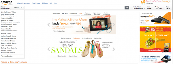
First, notice a strong “above the fold” design on the home page. Clearly they have things they want to promote. Mother’s Day. Shoes (btw, they know I was just searching for shoes at Nordstrom, so they put shoes in front of me on Amazon — tricky, no?). Apparently they know I love Pringles (yup!). And they are pushing their Amazon Fire TV.
I guarantee 80% of the clicks are definitely “above the fold”. Either searches, menu links, or one of the highlighted promotions. I clicked on the page for the Amazon Fire TV. And look at that…
The important information is at the top. The Amazon we have known for years. Product left. Information in the middle. Buy button in the upper right. But, gosh, this is a big purchase and it’s so interesting…I’m going to scroll, and scroll, and scroll, and scroll, and scroll.
Notice, they aren’t making me click around to several sub-pages, each one telling me one small thing about the Amazon Fire TV. Nope, they’re putting it all on one long page. Because, Amazon.com, the site that puts more money into studying usage than just about any other online company, knows that people, when they want information, scroll. And they scroll a lot.
In Summary
“Above the fold” has its place in web design, but it’s not the holy grail of web design. This is particularly true for sub-pages of your website.What’s more, websites that are designed with “above the fold” as their mantra are, not only, uncomfortable for the user, but they discourage scrolling (so things that fall below the scroll are more often missed), and they will soon be outdated.
On average, thirty percent of those who are accessing the websites we manage are doing so on a mobile device. Within the next few years, more people will be accessing websites on mobile devices (smartphones, tablets, and things we don’t even know about yet), than they will their computer. Meaning “above the fold” is a goner, because “the fold” changes depending on these devices.
More important than the fold is good web design and a designer who is forward thinking — and who knows that statistics are often misleading.